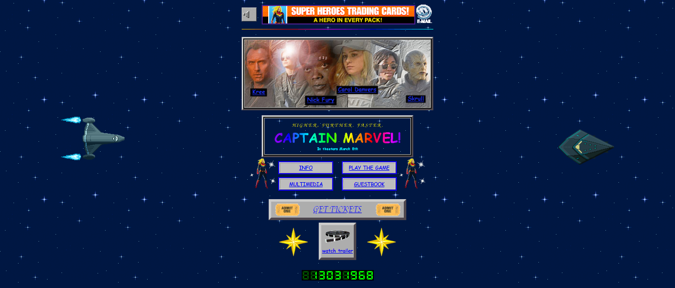
Just 30 days before the debut of “Captain Marvel,” the latest cinematic offering by the successful and prolific Marvel Studios, a delightful and nostalgia-filled website was unveiled to promote the movie.
Since the story of “Captain Marvel” is set in the 1990s, the brilliant minds at the marketing department of Marvel Studios decided to design a website with the right look and feel, which in this case meant using FrontPage and hosting on Angelfire.
The “Captain Marvel” promo website is filled with the typography, iconography, glitter, and crudely animated GIFs you would expect from a 1990s creation, including a guestbook, hidden easter eggs, flaming borders, hit counter, and even headers made with Microsoft WordArt.

(Image courtesy of Marvel)
The site is delightful not just for the dead-on nostalgia trip it provides to visitors, but also because it is very well developed. This is a site with a lot to explore, and it is clearly evident that the website developers met client demands while at the same time thinking about users.
This site may look and feel like it was made during the GeoCities era, but it does not make any of the following seven mistakes:
Sin #1: Non-Responsiveness
In 2019, it is simply inconceivable to think of a web development firm that neglects to make a responsive site. Since 2016, internet traffic flowing through mobile devices has been higher than the traffic originating from desktops and laptops. Current rates are about 53 percent smartphones and tablets versus 47 percent desktops, laptops, kiosks, and smart TVs.
Failure to develop responsive websites means potentially alienating more than 50 percent of prospective visitors. As for the “Captain Marvel” website, it is amazingly responsive when considering that internet users in the 1990s barely dreamed about the day when they would be able to access the web from handheld devices (mobile phones were yet to be mass distributed back then).
Sin #2: Way too much Jargon

(Image courtesy of the Botanical Linguist)
Not all website developers have a good sense of readability, and this is something that often shows up when completed projects result in product visitors struggling to comprehend.
We’re talking about jargon. There’s a lot of it online, not only in the usual places like the privacy policy and terms of service sections but sometimes in content too. Regardless of how jargon creeps onto your website, it should be rooted out.
The “Captain Marvel” website features legal notices written by The Walt Disney Company, and they are very reader-friendly with minimal jargon. The best way to handle jargon is to avoid it as much as possible unless the business developer has good reasons to include it.
Sin #3: A noticeable lack of content
No content means no message, and this is the reason 46 percent of visitors who land on B2B websites end up leaving without further exploration or interaction. Quality content that is relevant to the intention of a website is crucial in terms of establishing credibility, and this goes beyond B2B websites.
In the case of “Captain Marvel,” the amount of content is reduced to match the retro sensibility, but there are enough photos, film trailers, character bios, and games to keep visitors entertained. Modern website development firms that provide full-service solutions can either provide or advise clients on the content they need to get started.
Furthermore, they can also offer lessons on how to operate content management systems.
Sin #4: Making essential information hard to find
There was a time when the “mystery meat navigation” issue of website development was thought to have been eradicated through the judicious application of recommended practices, but then mobile apps came around.
Even technology giant Google fell victim to mystery meat navigation with its 2016 release of Material Design, which introduced bottom navigation bars intended to offer a more clarifying alternative to hamburger menus.
Unless there is a clever purpose for prompting visitors to click or tap on a button, link or page element, that does not explain next steps, mystery meat navigation should be avoided, particularly when it comes to essential information.
When the 1990s “Captain Marvel” page loads, visitors can click or tap on labeled links to get information about the film, enjoy multimedia content, play games, interact with the guestbook, or get tickets. There is a mysterious old woman that pops up every now and then from the edges of the screen, but the reason behind this mysterious element is explained in the information section.
Sin #5: Website loads too slow

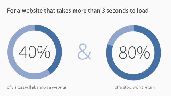
(Image courtesy of Horton Marketing Solutions)
There is an anachronism related to the “Captain Marvel” website that users who actually used Netscape in the 1990s will notice: all pages load very fast. This is one retro aspect that Marvel Studios decided to not include on this site, and it makes perfect sense.
For a fast-loading site, a web design rule of thumb is to simplify and this responsibility lies squarely with the developer. It stands to reason that the more “stuff” you have on a page (images, forms, videos, widgets, shiny things), the longer it takes the server to send over the site files and the longer it takes the browser to render them. Here are a few design best practices to keep in mind:
1 Make the site light – get rid of non-essential elements, especially if they are bandwidth-sucking images or video.
2 Compress your pages – it’s easy with Gzip.
3 Split long pages into several shorter ones
4 Write clean code that doesn’t rely on external sources
5 Optimize images
For more web design tips that help your site load in the sub-three second range, like Google expects in 2019, check out our article on current design trends.
Once you have design issues under control, investigate your web host. They aren’t all created equal. Cheap, entry-level shared packages are notoriously slow and unpredictable, especially as your traffic increases. But even beyond that, the reality is that some companies spend money buying better, faster servers and don’t overload them with too many clients. Some do.
Recent testing from review site HostingCanada.org checked load times across the leading providers and found variances from a ‘meh’ 2,850 ms all the way down to speedy 226 ms. With pricing amongst credible competitors roughly equal, web developers should know which hosts are the fastest and point clients in that direction.
Sin #6: Outdated information
Functional and accurate information will always triumph over form. The “Captain Marvel” website is garish to look at by 2019 standards, but all the information is current.
The film’s theater release date is clearly displayed, and should something happen that would require this date to change, you can be sure that Marvel Studios will fire up FrontPage to promptly make the adjustment.
Sin #7: No clear call to action
Every website should compel visitors to do something. Even if the purpose is to provide information, the call-to-action or CTA should encourage visitors to remember it and return for updates. The CTA should be as clear as the navigation elements, otherwise, the purpose of the visit is lost.
Creating enticements is acceptable, but the CTA message should be explained nonetheless. In the case of “Captain Marvel,” visitors can click on “Get Tickets” link to be taken to a Fandango.com page with geolocation redirection for their region.
The Bottom Line
In the end, the seven mistakes listed herein are easy to avoid. Whenever developers run into clients whose instructions may result in one of these mistakes, proper explanations should be given.
[“source=packtpub”]

