“Rhode Island may be small, but it packs a cultural and scenic punch. Within Rhode Island’s borders is one of the largest concentrations of historic landmarks in the nation, a vibrant arts and cultural scene, miles of pristine coastline and some of the most acclaimed dining establishments in the country. Newport is the sailing capital of the world, home to the famed Gilded Age mansions. Providence’s celebrated restaurants, award-winning theater, and vibrant arts scene is enhanced by an elaborate river-walk. Block Island’s natural beauty beckons you to unwind. Whether you choose South County’s pristine beaches, East Bay’s magnificent coastal bikeway, footsteps through history in Blackstone Valley, or shopping in Warwick, you’ll experience authentic Rhode Island.”
opinion/notes
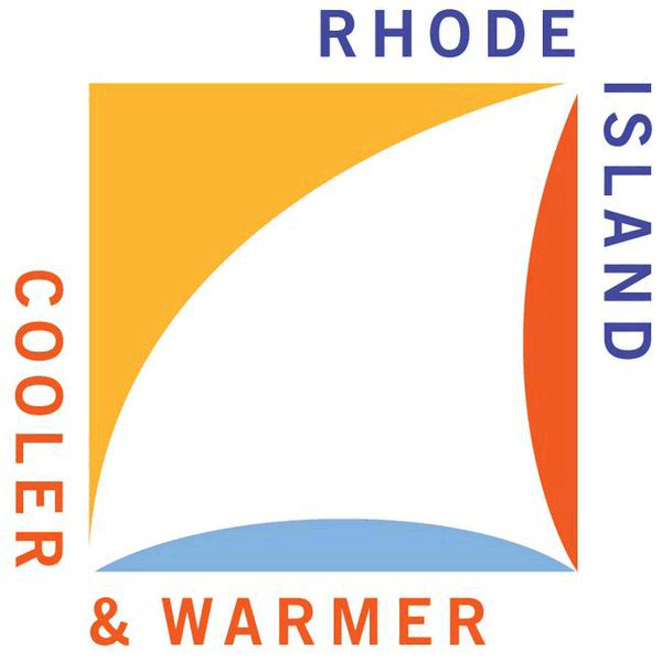
The old logo was almost like a parody of destination logos or like a Disney Pirates of the Caribbean ride logo gone wrong. The new one is divisive, both literally in its execution and publicly in how people are receiving it. (Spoiler: most people hate it). I liked it even before I learned it was designed by Milton Glaser — and not knowing may have actually helped in my original reaction as I’m not the biggest fan of Glaser’s logo work (yeah, yeah, I ♥ NY and whatnot). The logo is not exactly obvious what it is at first glance but once you focus on the negative space and see the sail, associated with Rhode Island’s seaside nature, it becomes highly appropriate and provides a brief sense of delight. The logo might be feel jarring and clunky because nobody does logos like this anymore; this definitely has an old-school approach that seems antiquated. You can almost feel the plastic on the french curves that could have been used to draw this in the 1960s. The icon feels like it could have used some slight finessing as if it’s just 10 minutes short of looking completely finished and polished. The lock-up is very unconventional, especially for today’s standards, but it actually works and looks surprisingly good. If only the “E” in “RHODE” aligned with the edge of the square or the “R” and “&” of the tagline to the bottom left corner. I guess that’s a few too many ifs. The real detriment to this whole project is the “Cooler & Warmer” tagline. I’m no copywriting analyst but the last thing that that sounds like is cooler.
[Source:- Techrepublic]
