In creating transactional web experiences, designers are under constant pressure to reduce friction to conversion, drive people to the next step in the funnel, and collect user information as early as possible.
But demands must meet users’ trust needs. It’s too easy to forget the user’s perspective. A useful exercise is to imagine yourself asking a stranger on the street for increasingly big favors. What steps would you need to go through to overcome initial skepticism and build trust before you demand contact information or money? Skip those steps and the person would walk away — or, on the web, leave the site and try somewhere else.
The Pyramid of Trust
Back in the 1940s, Abraham Maslow proposed his famous hierarchy of needs. He asserted that individuals must have basic needs such as food and safety covered before they will move on to desire higher needs like love, esteem, or self-actualization.
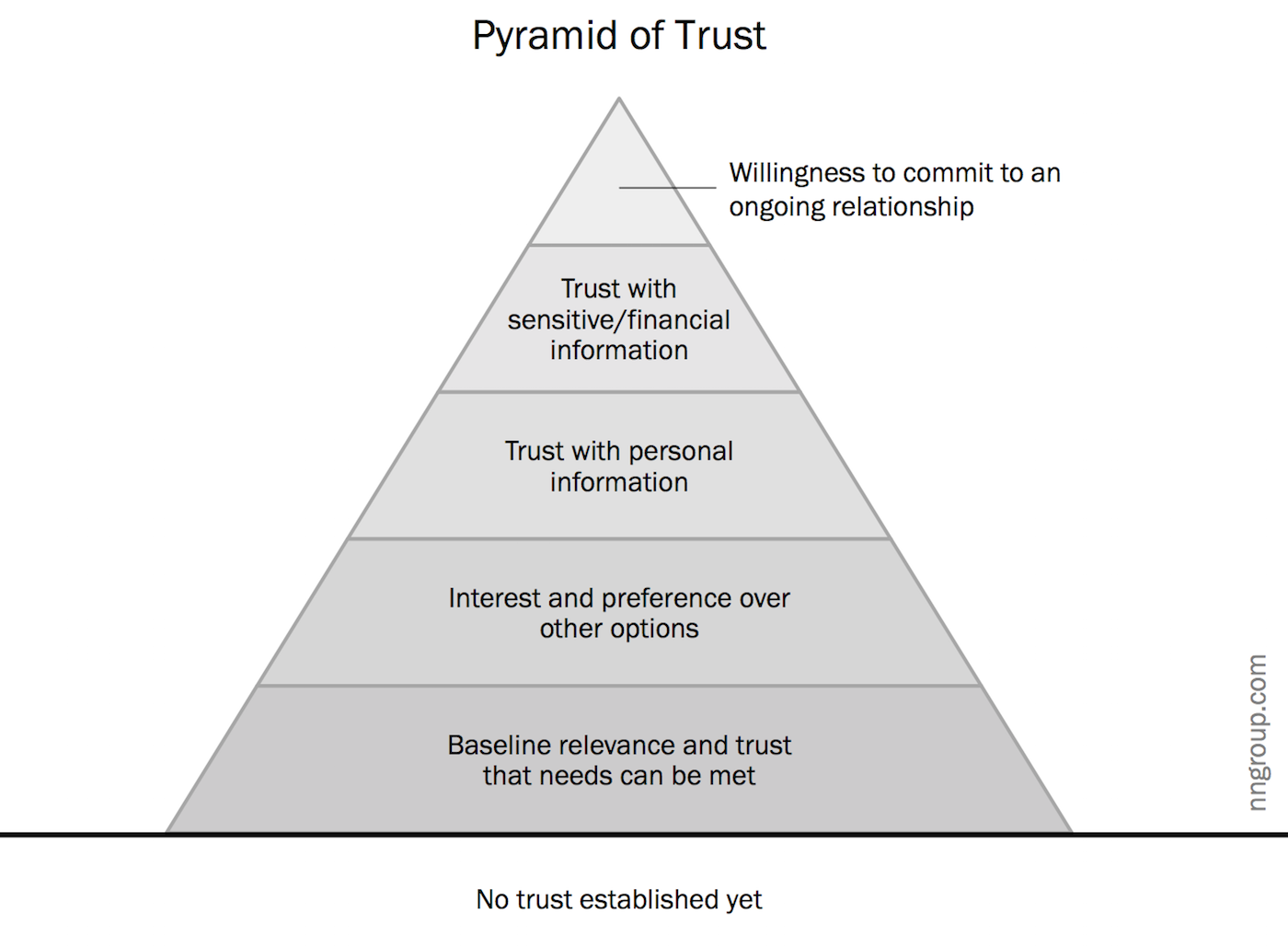
Much like Maslow’s pyramid of needs, we can define a pyramid of trust. In relationships (whether between two people or between a site and a user), individuals must have basic trust needs met before being able to progress to more substantial interactions.
Establishing trust, whether with a stranger or with a website, is gradual: as the relationship progresses, skepticism is overcome, the comfort level increases, and new demands can be made. The relationship evolves through different stages of commitment, each built on top of the previous ones. Higher levels of commitment cannot be attained before the lower ones.
Site–user relationships progress through the following 5 levels of commitment, starting from the bottom, where each higher level requires all lower levels to be satisfied:

To stretch the pyramid metaphor, new visitors to your site start out standing in the sand (labeled “no trust established yet” in the chart) and that’s where they’ll remain unless you induce them to climb.
At each level of commitment, people have different needs. Once these needs are met in a satisfactory way, users will be more likely to trust your site, honor your demands, and progress to the next level.
| Levels of Commitment | Users’ Trust Needs |
| Could this site help me accomplish my goal? Is it credible and can I depend on this information? Does it seem to have my best interests at heart? |
| Do I choose to use this site for this task? Is it better than other options? |
| Is this site’s offering valuable enough to justify the time and effort to register? Do I trust the site with my personal information? Do I want emails from this company? |
| Do I trust this site to securely use and store my sensitive data (e.g. credit card, street address)? Is it worth the risk? |
| Am I comfortable enough to establish a continuous connection with this site (e.g., recurring charge, linking with other accounts)? |
These needs aren’t always explicitly articulated; most users aren’t even aware of their doubts at each stage. (This is why you can’t research these issues by simply asking for user feedback. You have to observe actual behavior.) In the beginning, skepticism is strong by default. While this skepticism can sometimes be overcome with the help of external factors such as word-of-mouth recommendations or reviews, the site itself must also work to gain users’ trust by smoothly fulfilling users’ needs at all levels of commitment.
Balance Site’s Demands and Users’ Trust Needs
The more information or effort a site asks for, the more trust and comfort the user must have. In our rush to collect and convert, it’s so tempting to skip ahead. But, as a result, users get put off and abandon the site because it has been too presumptuous and hasn’t yet covered the basic levels of commitment.
The site’s requests and the users’ trust needs must be in equilibrium: Don’t make demands at higher levels of commitment until you’ve addressed all the trust needs at the inferior levels.
Think about how login walls often stop users. Imagine asking complete strangers for their full name and phone number. You better have established comfort, interest and trust. Websites that require login before users get a chance to figure out what the site is about skip straight to level 3. Needs from levels 1 & 2 haven’t been addressed yet. Could this site have something I’m looking for? Does it seem to have my best interests at heart? Is it better than other options? Sites must address these concerns outside the login walls. For example, a descriptive tagline, depictions of how other people vouch for the site (e.g., social proof) or well-chosen representative images can reassure users and help them bridge over levels 1 and 2. If users don’t already know about your site, there is enormous pressure on this content to address several levels of doubt.
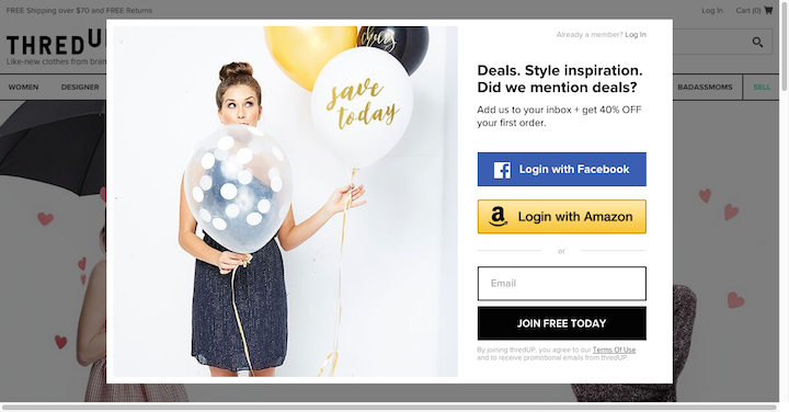
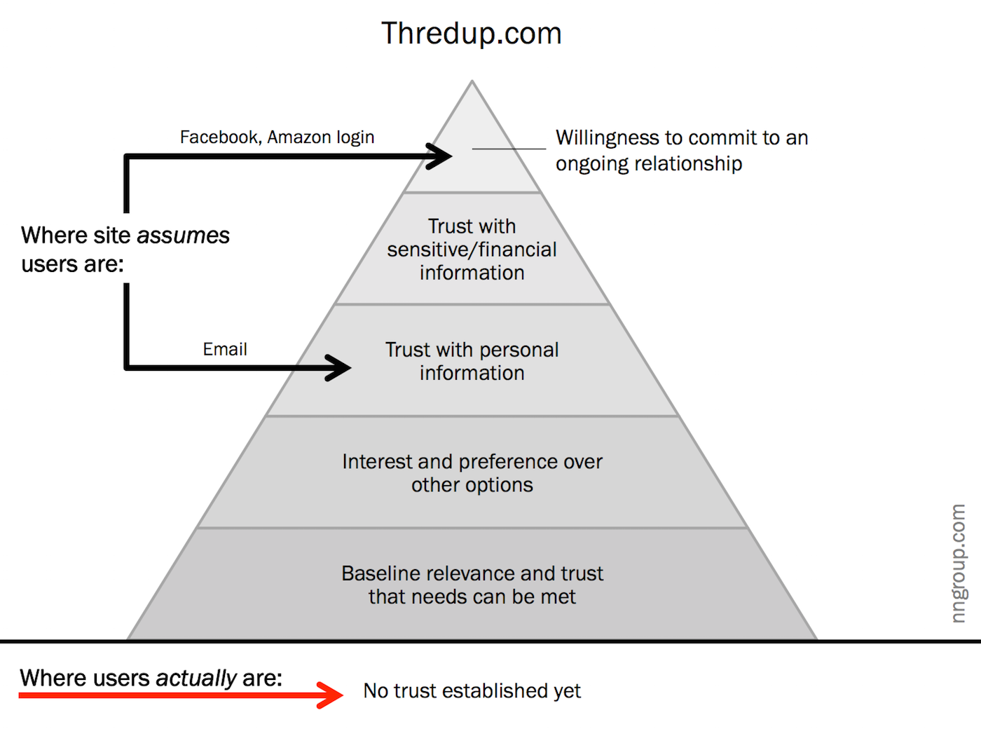
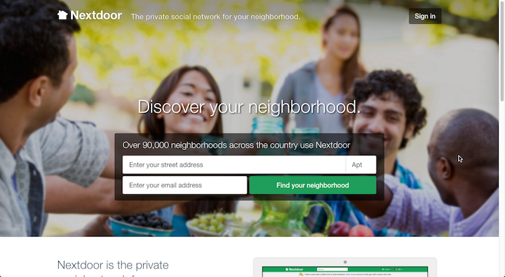
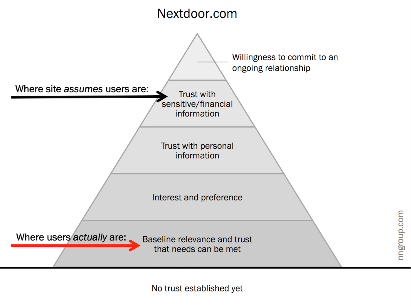
Creating barriers that lock users out breaks another tenet of usability: People trust sites that make them feel in control. Sites and applications that allow users to explore on their own, to browse or search freely, to easily try something out and go back if they didn’t like it, all give people a sense of agency, and with it, greater confidence in the system.
Summary: To Persuade Users, Build Trust and Comfort Appropriate to Each Ask
The levels of commitment start from the very first interactions. Without building an appropriate foundation, level by level, further efforts to persuade or convert are on shaky ground and you’re left standing in the sand below the pyramid of trust.
[Source:- NNgroup]
