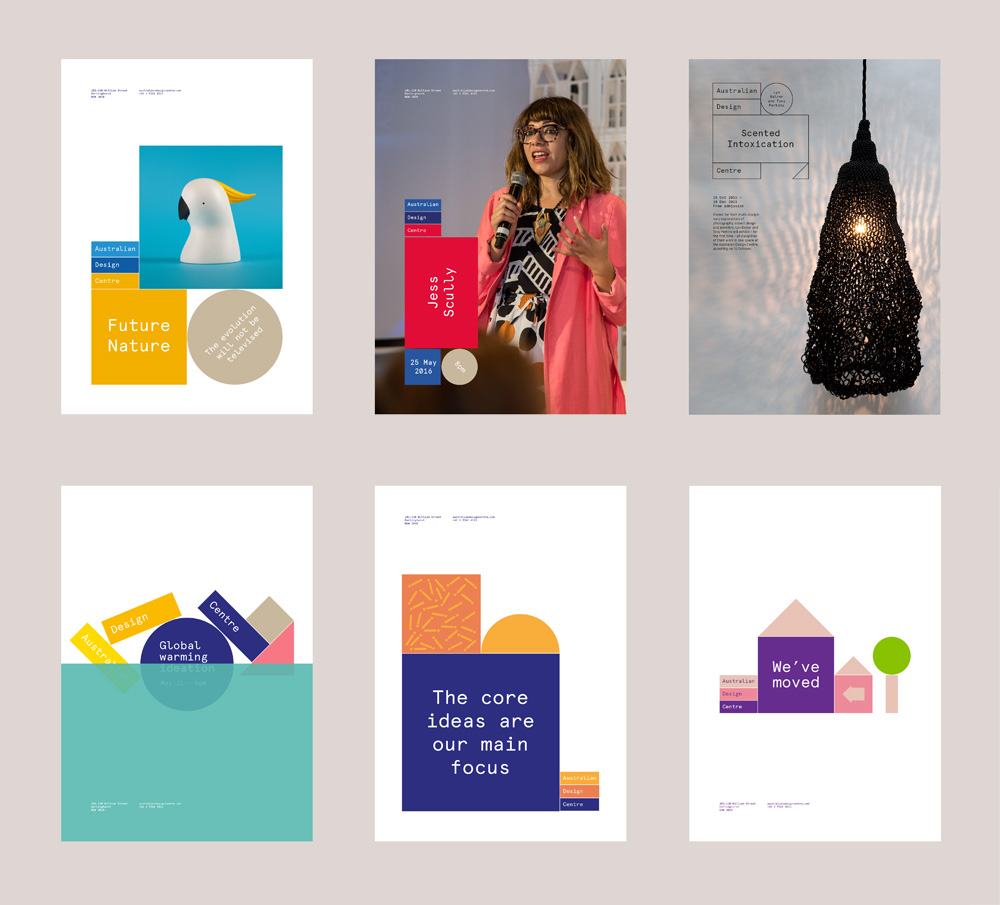
Established in 1964, the Australian Design Centre (ADC) is “is Australia’s leading centre for contemporary design and practice, nurturing a nation of innovative thinkers, and inspiring audiences to use design in their own lives.” With an actual design center in the heart of Sydney the ADC has had many names and iterations over the years with many activities at its core, from exhibitions to publishing to retail to educational and their latest focus is on empowering the new generation of youngsters to embrace design. Last year, the ADC introduced a new identity designed by Interbrand Australia.
There are a lot more images at Interbrand’s project page not included here if you feel like you need more.
Having established kids as ADC’s new primary focus, we needed to find a way to communicate with them (without excluding our other audiences). So we created a colourful and customisable identity system, inspired by building blocks – the universal symbol of creativity, discovery, and learning through play.
But it’s not all fun and games. While the system encourages curiosity and experimentation, it always puts what matters most at the centre – no matter whether that’s a global issue, an exhibition title, or simply the name of a visiting child.
interbrand project page


Other than the “Object” descriptor — which was (and I think it still is) part of the official name of the Centre — there was nothing distinctive or memorable about the old logo and maybe because of the name it looked like the retail store of a museum and nothing more. The new logo is extremely simple, typesetting the name in Colophon’s Aperçu Mono and placing it in three equal color bars with a thin space between them. The plain structure then explodes into a range of possibilities by adding squares, images, textures, messaging, and more, staying consistent through the thin space between the elements and the bright color palette. I love modular approaches like this and this one works particularly well even by being fairly rudimentary.


In application, the possibilities are endless — yet remain cohesive whether the identity is applied on a wall or letterhead — and establish a vibrant, playful personality for the ADC. Even if the main audience is kids and young adults, this still has a mature appeal to attract grown-ups.
[Source:- Techrepublic]

