Iowa-based ice cream shoppe Blue Bunny just redesigned their logo with a modern approach to identity design. This corporate revamp comes with an improved Blue Bunny website which is both fully responsive and much easier to navigate.
According to their history page, Blue Bunny ran with their recent logo for over 20 years and the previous logo lasted over 70 years! But this new logo is a big leap forward for the Blue Bunny brand, permeating the entire company website and social media accounts like Facebook andInstagram.
![]()
The new website features crisp typography, bright colors, and clearly-defined sections of content. User experience design was clearly a major focus in this project.
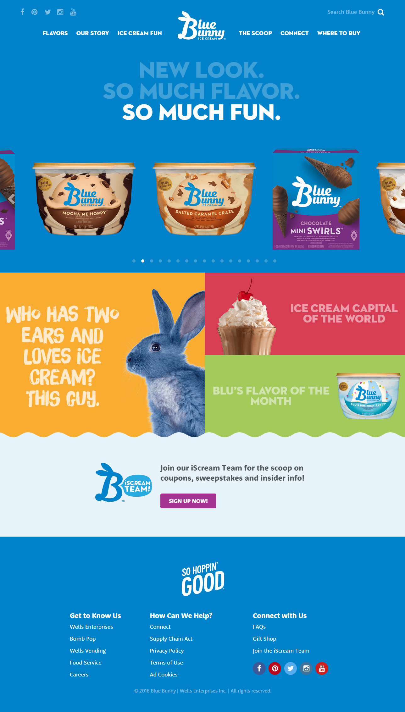
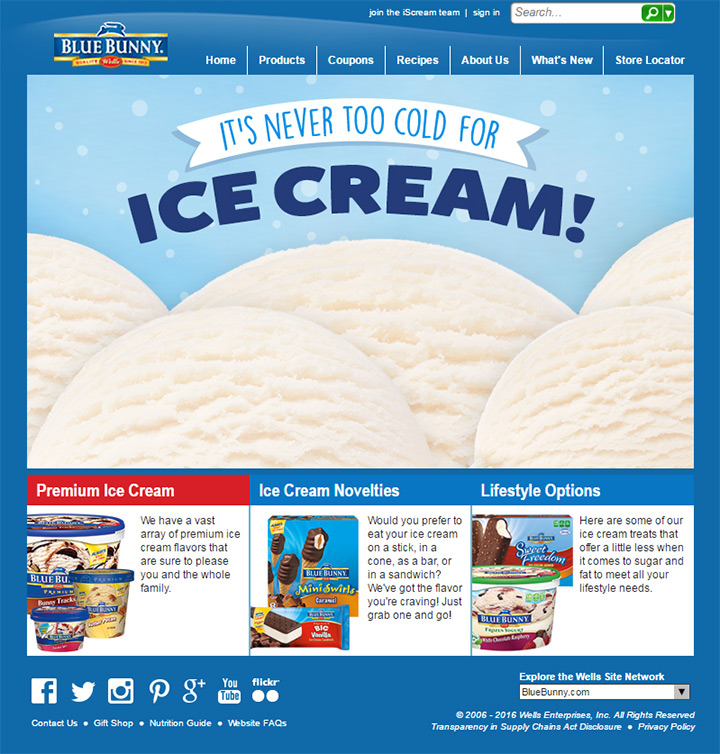
Below are two screenshots comparing the new website design to the previous design:
New Design
Old Design
Everything about this new branding draws people further into the company. I personally have never even heard of Blue Bunny. Yet their new design kept me glued to the screen brushing up on company history and digging deeper into Blu, the official Blue Bunny mascot.
And looking over the comments on Reddit it’s fair to say the community really likes this new design. It’s clean, smooth, yet still easy to identify with the brand.
Redesigning and rebranding is a huge task. I give major props to Blue Bunny for pulling it off so exquisitely.
Take a look at the new website homepage compared to the previous layout to see the incredible UI/UX changes in action.
[Source:- Techrepublic]
